 Like Tony Spyra , Giuseppe Colarusso thrives on creating illusion, dissonance and visual confusion. He looks at the everyday and manipulates objects in small ways that totally transform them. I personally love the drainless sink, it's a great compliment to Tony's Bowl with drain. These guys need to get together for tea.
Check it out here.
Like Tony Spyra , Giuseppe Colarusso thrives on creating illusion, dissonance and visual confusion. He looks at the everyday and manipulates objects in small ways that totally transform them. I personally love the drainless sink, it's a great compliment to Tony's Bowl with drain. These guys need to get together for tea.
Check it out here.
Friday, September 6, 2013
Giuseppe Colarusso
Like Tony Spyra , Giuseppe Colarusso thrives on creating illusion, dissonance and visual confusion. He looks at the everyday and manipulates objects in small ways that totally transform them. I personally love the drainless sink, it's a great compliment to Tony's Bowl with drain. These guys need to get together for tea.
Check it out here.

Tuesday, August 20, 2013
Kid Hazo
 Kid Hazo is a Philadelphia street artist who loves his city so much, he mocks it at every turn. I mean that sincerely in the sense that he sees the city for what it is, embraces it, then turns it around on itself through his ironic street signs. He creates mock signs that have relevance to a certain neighborhood so that the people who live there can have a good laugh. They're really a refreshing set in the saturated world of street art.
Check them out here.
Kid Hazo is a Philadelphia street artist who loves his city so much, he mocks it at every turn. I mean that sincerely in the sense that he sees the city for what it is, embraces it, then turns it around on itself through his ironic street signs. He creates mock signs that have relevance to a certain neighborhood so that the people who live there can have a good laugh. They're really a refreshing set in the saturated world of street art.
Check them out here.
Monday, August 19, 2013
Plastic Jesus
 Just a funny concept, taking something holy to millions of people and making it totally disposable. Plastic Jesus obviously appreciates this sense of humor and pulls it into [his] work. I think my personal favorites are the "Useless Plastic Box" and the "Credit Trap".
Check them out here.
Just a funny concept, taking something holy to millions of people and making it totally disposable. Plastic Jesus obviously appreciates this sense of humor and pulls it into [his] work. I think my personal favorites are the "Useless Plastic Box" and the "Credit Trap".
Check them out here.
Monday, July 15, 2013
OX
 I'm loving the simplicity of the work by Parisian artist OX. He does billboard takeovers that are beautiful and fresh. You can't ignore them, that's for sure. OX also works with the specific location a lot which makes for a good laugh sometimes.
Check them out here.
I'm loving the simplicity of the work by Parisian artist OX. He does billboard takeovers that are beautiful and fresh. You can't ignore them, that's for sure. OX also works with the specific location a lot which makes for a good laugh sometimes.
Check them out here.
Wednesday, April 10, 2013
Dan Tague
 Fuck oragami. Dan is a true master of the folded paper arts with his Live Free or Die series of folded American money. He folds the bills is ways to connect the letters that naturally appear on the bills, yet finds revolutionary phrases or song lyrics or simple statements on society.
Check it out here.
Fuck oragami. Dan is a true master of the folded paper arts with his Live Free or Die series of folded American money. He folds the bills is ways to connect the letters that naturally appear on the bills, yet finds revolutionary phrases or song lyrics or simple statements on society.
Check it out here.
Wednesday, March 20, 2013
Toni Spyra
 Toni has the lightning wit of Banksy, but manifests it through objects, not paintings. His work has such a fantastic sense of humor and is beautifully executed. I particularly like the billy club pool que and the bowl with drain.
Check it out here.
Toni has the lightning wit of Banksy, but manifests it through objects, not paintings. His work has such a fantastic sense of humor and is beautifully executed. I particularly like the billy club pool que and the bowl with drain.
Check it out here.
PREF
 Peter Preffington, aka PREF, aka Peter Preffington is on the first glance a traditional graffiti artist. Spray paint on walls, pretty straight forward. But if you look deeper you find a master illusionist. How many of his 'burners' can you decipher before you want to gouge your eyes out? They are just amazing.
Check it out here.
Peter Preffington, aka PREF, aka Peter Preffington is on the first glance a traditional graffiti artist. Spray paint on walls, pretty straight forward. But if you look deeper you find a master illusionist. How many of his 'burners' can you decipher before you want to gouge your eyes out? They are just amazing.
Check it out here.
Monday, February 18, 2013
Retna & Louis Vuitton
 This is a partnership between art and brand I wouldn't have expected, but it totally works. X Retna recently transformed the front of the Louis Vuitton in Miami. It's really beautiful and feels right as a bridge between are and commerce. It is part of LV's collaboration with artists that started with Os Gemeos.
Check it out here.
This is a partnership between art and brand I wouldn't have expected, but it totally works. X Retna recently transformed the front of the Louis Vuitton in Miami. It's really beautiful and feels right as a bridge between are and commerce. It is part of LV's collaboration with artists that started with Os Gemeos.
Check it out here.
Wednesday, January 30, 2013
Vinz

Friday, September 21, 2012
Jim Darling
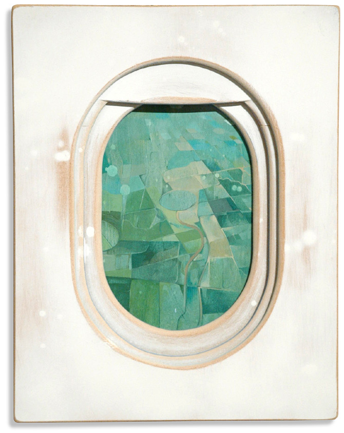 Jim is hard to pin down. He's a designer, he's a painter, he's a sculptor. The project that caught my eye and thought it was a great delivery of an image a lot of us are used to is his 'Windows' series. We've all taken photos of these views, but Jim renders them in paint on board in a beautifully abstract way and with a subtle depth that really brings them to life.
Check them out here.
Jim is hard to pin down. He's a designer, he's a painter, he's a sculptor. The project that caught my eye and thought it was a great delivery of an image a lot of us are used to is his 'Windows' series. We've all taken photos of these views, but Jim renders them in paint on board in a beautifully abstract way and with a subtle depth that really brings them to life.
Check them out here.
Tuesday, June 12, 2012
Specter
 Specter has been established in the street art movement for some time. His recent series, "the bodega project" caught my eye. In the photo above, that's not a real store, that's his addition to the wall. Specter refuses to be defined by what most street art is. He prefers to work very realistically, mimicking everyday scenes that might flash by in an instant for us, but are frozen permanently by his masterful brushwork.
Check it out here.
Specter has been established in the street art movement for some time. His recent series, "the bodega project" caught my eye. In the photo above, that's not a real store, that's his addition to the wall. Specter refuses to be defined by what most street art is. He prefers to work very realistically, mimicking everyday scenes that might flash by in an instant for us, but are frozen permanently by his masterful brushwork.
Check it out here.
Monday, June 11, 2012
David Buckingham
 David makes amazing sculpture from the decaying roadsides of America. His gun series uses bent and shaped roadsigns and old car parts to make large primary colored replicas of famous murderers firearms. His Words&Symbols series is one of my favorite 3 dimensional works ever.
Check it out here.
David makes amazing sculpture from the decaying roadsides of America. His gun series uses bent and shaped roadsigns and old car parts to make large primary colored replicas of famous murderers firearms. His Words&Symbols series is one of my favorite 3 dimensional works ever.
Check it out here.
Wednesday, June 6, 2012
Trash Lovers
 These guys are great. They don't do art for money or popularity, they do it for love. They don't even keep their work or hang it in galleries, they let the trash men come and take it away.
Check it out here.
These guys are great. They don't do art for money or popularity, they do it for love. They don't even keep their work or hang it in galleries, they let the trash men come and take it away.
Check it out here.
Sunday, February 26, 2012
Paula Swisher

I saw one of Paula's works on FFFFOUND and thought that the contrast between the technical chart look of the diagrams and the softness of the birds was really beautiful.
Check out the whole series here.
Monday, January 30, 2012
Death Spray Customs

Normally known for some gorgeous motorcycle paint jobs, this collective have gone outside their box and created a series of graphically painted car hoods called Delight & Destroy. Using brave colors and skilled typography each is a real work of art.
Check them out here.
Friday, January 20, 2012
Peter Stults
In a world (preview guy voice) where the actors of days gone past, return to have their revenge on recent movies. What would the posters look like? After seeing a series designed by Sean Hartter, Peter Stults knows and blesses us with his fantastically detailed designs of these modern meet classic marvels.

Peter Stults

Sean Hartter
Check out Peter's designs here.
Check out Sean's designs here.

Peter Stults

Sean Hartter
Check out Peter's designs here.
Check out Sean's designs here.
Friday, December 2, 2011
mentalgassi

Mentalgassi's been around for a little while inserting his humor on everyday objects. Whether they're giant floating heads in a marina or a face on a ticket dispenser, he seems to really find gems wherever he bombs. He also did a really nice piece for Amnesty International a couple years back that I only now saw was his work.
Check it out here.
Thursday, December 1, 2011
Stanley Borack
I have a new favorite artist of the moment. Stanley Borack. He passed away in 1993, so he's obviously not a new artist, but his work is fantastic. He served in the Navy during WW2 and when he got back went to art school to study painting. Out of school he started painting book and magazine covers, which is what he ended up doing for the remainder of his career. In my opinion, the strongest work came out of his pulp phase in the late 50s where he was doing covers for mystery novels about Nazis, cowboys and Amazon women. I love his use of negative space since he always new the title and author information would have to be laid into the composition.


Check it out here.
And here.


Check it out here.
And here.
Friday, November 25, 2011
Susan Kare

This is a little off the norm, but it's total worth a gander. Susan Kare was the artist charged with creating the icons for Apple early on. Her sketchbook was recently scanned and publicized for all to gaze upon. It gives you a new appreciation for graph paper.
Check it out here.
Tuesday, November 22, 2011
Richard Sargent

Richard Sargent shoots billboards. Not in the redneck with a rifle and a pickup sense, but with a camera sense. He stalks decaying billboards in the East Bay area and frames them up square so they take on a really abstract quality. To take something from ugly to gorgeous in 1/250th of a second is a real talent.
Check them out here.
Subscribe to:
Posts (Atom)