Tuesday, November 24, 2009

Vincent Pacheco


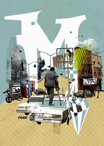
Co-founder of the WAFA (We Are Fucking Awesome) art collective, Vincent looks to vintage magazines for inspiration. Collaging together old ads, fashion photography, text and titles he (and co.) create new compositions that excite and intrigue. Sometimes they show the work in their space, sometimes they invade a wall of an abandoned building, beautifying it with their art.

Check it out here.

And here.

Charlie Owens


Charlie's an illustrator inspired by pretty girls, city life, punk rock, skateboarding and comics. His work is beautifully rendered and has a great dimentionality to it for illustration. His use of type in his compositions elevates it above most other illustration too.


Check it out here.

Friday, November 20, 2009

Scott Campbell


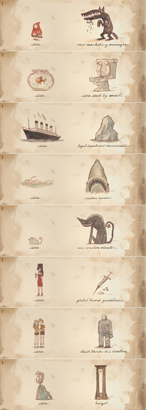
This isn't the same Scott Campbell as the previous post. I am not sure that they could be any more different. This Scott is an illustrator working in ink and water color. He's got a great sense of humor with his drawings. And he even makes puppets.

Check it out here.

Thursday, November 19, 2009

ripo

10 DAYS from ripo on Vimeo.


This is an amazing project. He paints a headline a day. One on top of another using beautiful hand rendered typography.

Monday, November 16, 2009

Joshua Allen Harris


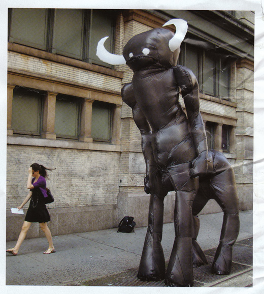
Joshua works with things that we throw away. Not even just throw away, but throw things away in. He works with plastic bags. And twist ties. He glues these bags together to make animal forms, which would be boring, until he ties them to subway grates and when the trains pass underneath the animals fill with air and come to life. So cool.

Check it out here.

Jordan Jelev


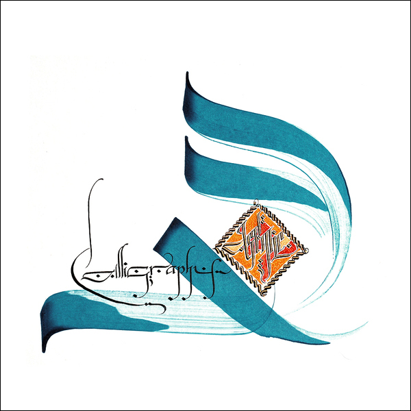
This master calligrapher is known as the Labelmaker for his amazing design of wine labels. His work starts by hand and is then refined digitally, but really, I prefer the handwork.

Check it out here.

Anonymous


Not sure who this is, but I have a feeling we'll be seeing a lot more of them.

Friday, November 13, 2009

Art Decks


This isn't an artist, but it's a dope project. These people make huge cassette tapes out of wood and plexi. They can put any band name you want on them, and you pick the graphics. Something every old school head should have.

Check em out here.

Space Invader


8 bit graphics have been making a serious comeback. In part to artists like Space Invader. He uses colored tiles and even Rubic's Cubes to create low fi looking graphics. With the tiles, he makes large versions of Atari's Space Invaders evil invaders and then mounts them to walls all over the world using construction caulk. He even makes maps of where you can go to see these installations and sells kits so you can do it yourself.

Check it out here.

Roadsworth


Talk about using your environment in creative ways. Roadsworth looks for street graphics and objects that can be manipulated to make them more than they are. He loves crosswalks more than anyone thought possible. Making bandoleers, conveyor belts and other playful converstions using just white and black paint.

See what else he's doing here.

Numskull


For an Aussie, Numskull can sure use American cartoon imagery like the best of them. His work focuses on Disney characters, sign typography and comic book typography. He paints mostly on wood, treating it with stains, fire and dirt sometimes. Sometimes he just leaves it clean to be plywood and nothing more, but it gives the feeling like it used to be covering a window somewhere and had been painted on and pulled down. His graffiti work is more traditional graf lettering, but still quality work.

Check it out here.

Thursday, November 12, 2009

Dan Witz


Dan works in a much different way than most street artists. He renders in a super realistic style, hummingbirds, tiny people skateboarding, door windows with people peeking through and other things that don't really belong where he paints them. He uses brushes not cans and paints them so beautifully that most people probably mistake them for photo stickers or don't even notice them at all. In his latest series he paints grates and windows with disturbing looking people peeking out of them or gripping the bars with torn fingers.

Check it out here.

Wednesday, November 11, 2009

Ben Frost


Color? You like color right? Well you better if you are going to look at Ben Frost's paintings. You practically have to wear sunglasses to look at them. His inspiration comes from all over, but with a lot of artists here many come from popular media. He also draws from porn, youth, violence and recent pop history.

Check them out here.

James Gallagher


On the collage tip, James Gallagher works in a more minimalist fashion than the previous couple entries, but no less interesting. He creates unsettling images by geometrically combining newspaper text and faceless figures in monotone compositions that seem to speak about media culture and anonymity in today's society.

Check it out here.

Tuesday, November 10, 2009

If you like Cless


He's got a piece in a collage artists show in NYC. It's at the Cinders Gallery. It closes this Friday so go check it out if you're up there.

infamecless


Cless is a collage artist from Spain. He does the most insane collage I've seen in a while. Really awesome stuff pulled from vintage magazines and all over.

Check them out here.

And here.

Steve Powers


Steve (aka ESPO) has been on the graffiti scene since the late 80s in Philly. Having moved to NYC sometime back, his work has developed a sign painter aesthetic. He takes ques from carnival signs, classic advertising and hand painted media in general. Then, for his canvases, he combines them with everyday hood slang terms and references to love, violence and capitalism. He's among one of my favorites.

Check him out here.

And here.

THS


Pronounced (this) THS was started by Thomas Schostok in 2002. He describes it as art an meets graphic design studio group. The art that comes out though is as good as any single artist's vision if not better than most.

Check it out here.

Scot Lefavor


Scot's work is great. It's very Roy Lichtenstein meets Barbara Kruger meets an airline emergency brochure. His use of graphic type and simplified figures gives his paintings a real universal appeal. Having a graphic design background has not only influenced his typography, but also his subject matter. Much of his characters look like they just stepped out of a 1950s advertisement. An appeal that never gets old.

Check them out here.

Monday, November 9, 2009

Escif


Escif is a Spanish graffiti artist. I'm still looking into them, but I really love the sketchy style of the art.


Check it out here.

Friday, November 6, 2009

BAST


Bast is one of my favorite collage artists. He's got such an interesting way of creating images that are ugly and beautiful at once. That also convey a sense of chaos, but everything feels like it was put down intentionally. When his works are up on walls (outside) they look like they've been there for years, even if they were just put up.

Check them out here.

Thursday, November 5, 2009

Aakash Nihalani


Aakash Nihalani is obsessed with perspective. Not like an opinion, but dimentional perspective. Aakash uses paint, tape, paper. His outdoor tape installations are the most interesting in my opinion. They are all site specific and are not really planned ahead of time. Great use of neon colors too.

Check it out here.

Adam Hathorn


In the same vein as Mike Giant, Adam is an unreal illustrator and painter. He also happens to do a mean tattoo. He takes ques from the tattoo and graffiti world along with religious iconography and just plain lowbrow humor.

Check it out here.

Mike Giant


Mike has the most unreal hand when it comes to pen and ink. He's inspired by Latino graffiti culture, tattoos, race cars and girls. He renders these subjects with such precision you'd think they were printed, or created on the computer.

Check them out here.

Wednesday, November 4, 2009

Jason Bernhart


I don't know a whole lot about Jason, other than he thinks small. Really small. Tiny in fact. He takes tiny scale figures like you'd get for a model train set and photographs them as if they were living among us. Us being giant humans.

Check them out here.

Klip Collective


This deviates a little from the normal post as it's not about an artist but more a medium. Klip Collective is a media group that creates onsite projections that work with the environment they're displayed in. They can even key in the architectural details and work around or within them. It's pretty amazing stuff.

Check it out here.

Tuesday, November 3, 2009

Cornelia Hesse Honegger


Since one of the clients I work on is insect focused, I found this body of work while doing research. Cornelia is a trained illustrator working mostly with insects. Since the Chernobyl incident in the 80s she's been collecting mutated insects from that and other nuclear sites and illustrating them. Disturbing and fascinating.

Check it out here.

Monday, November 2, 2009

Scott Campbell


Scott's an artist in NYC who used to tattoo primarily, but has now moved on to other creative endevors. His laser cut dollars series, Let It Rain is mindboggling in it's detail. It pulls imagery from tattoo and lowbrow culture and renders it in a way like I've never seen. His objects are equally as well crafted. Taking everyday things that are used for harm, like box cutters and broken bottles, he adorns them in gold with jewels therefore giving them an almost holy quality.

Check them out here.

Matt Siber


Matt's photography focuses on products and corporations and their effect on our landscape and the way we perceive quality. That's kind of a loose description of 2 of his projects. See the Floating logos and the Compare To projects.

Check them out here.

Halloween


Hope everyone had an amazing Halloween weekend. Got super busy so may not post today, but will try. Watch out for more good stuff tomorrow.