Friday, December 2, 2011

mentalgassi


Mentalgassi's been around for a little while inserting his humor on everyday objects. Whether they're giant floating heads in a marina or a face on a ticket dispenser, he seems to really find gems wherever he bombs. He also did a really nice piece for Amnesty International a couple years back that I only now saw was his work.

Check it out here.

Thursday, December 1, 2011

Stanley Borack

I have a new favorite artist of the moment. Stanley Borack. He passed away in 1993, so he's obviously not a new artist, but his work is fantastic. He served in the Navy during WW2 and when he got back went to art school to study painting. Out of school he started painting book and magazine covers, which is what he ended up doing for the remainder of his career. In my opinion, the strongest work came out of his pulp phase in the late 50s where he was doing covers for mystery novels about Nazis, cowboys and Amazon women. I love his use of negative space since he always new the title and author information would have to be laid into the composition.


Check it out here.

And here.

Friday, November 25, 2011

Susan Kare


This is a little off the norm, but it's total worth a gander. Susan Kare was the artist charged with creating the icons for Apple early on. Her sketchbook was recently scanned and publicized for all to gaze upon. It gives you a new appreciation for graph paper.

Check it out here.

Tuesday, November 22, 2011

Richard Sargent


Richard Sargent shoots billboards. Not in the redneck with a rifle and a pickup sense, but with a camera sense. He stalks decaying billboards in the East Bay area and frames them up square so they take on a really abstract quality. To take something from ugly to gorgeous in 1/250th of a second is a real talent.

Check them out here.

Wednesday, November 9, 2011

Max De Esteban


Max takes technique to the max on this project. He meticulously deconstructs the technology of yesteryear and photographs it layer by layer. He then reassembles the objects in Photoshop. I'm still trying to figure out how he got the color he did. It's amazing stuff.
He's currently showing the work at Klompching Gallery in NYC. So get up there before it comes down at the end of December.

Check it out here.

And here.

Tuesday, October 25, 2011

John Paul Thurlow


John is a master of graphite. His pencil drawings are the most insanely detailed works I've seen in a while. One of his series caught my eye recently. It's not his newest work, but its subject is certainly unique. Magazine covers. He does precisely detailed reproductions of magazine and record covers in pencil.

Check them out here.

Alexandra Bellissimo


I don't often feature photographers on here even though I have my degree in it. Chalk it up to over saturation, but there are exceptions. Alex is one of those. Her photo collages caught my eye because they're so extraordinarily simple. She combines things that you wouldn't normally see together, but in a really amazing way. She calls her work 'making pictures' instead of 'taking pictures'.

Check them out here.

Brian Hart


Brian is a painter from Massachusetts and a graduate of RISD. His work has a great textural quality to it and uses imagery from skeletons to Alice in Wonderland. One of his series caught my eye recently, his Alphabet Series. Each of the 26 paintings uses his standard catalog of images, but he hides an individual letter in each one. They're pretty rad.

Check them out here.

He's also got a really cool series of light paintings here.

Wednesday, September 28, 2011

TrustoCorp


TrustoCorp is a collective that takes parody seriously. They source out locations and augment them with their spoofs of advertising, signage and pop culture references. Their most recent stunt planted altered issues of popular celebrity magazines with headlines like 'Donald Trump Pregnant' along with graphic novel type illustrations in great monochrome color palettes. Their ad spoof stuff has a similar graphic language to that of ESPO aka Steve Powers in that it has a 50s graphic simplicity to it, though most of it is black and white.

Check it out here.

Prefab77


Prefab77 is a collective of artists from Northeast England. They take imagery from popular culture like fashion, fame, politics and history and collage it together in inspired and contrasting ways. Most of their work is about breaking down British culture and doing away with the old ways. They just did a great installation for Dublin Contemporary 2011 that uses type contrasted with fashion imagery in a really beautiful yet stark way.

Check it out here.

Wednesday, September 21, 2011

Alexandre Farto aka Vhils


Besides having an awesome name, Alexandre aka Vhils has an awesome style too. He has pioneered deconstructive stenciling. He covers a wall with plaster, or maybe it was already there. Then stencils on his design and goes to town on it with a hammer drill. Removing layers of plaster rather than adding layers of paint. He draws the figures out of the wall in a truly ghostly way.

Check it out here.

Monday, September 12, 2011

Noma Bar


Noma Bar is an Israeli illustrator who focuses on using negative space as a positive thing. He develops images that create a play between the negative and positive space that are both insightful and humorous.
His latest project is a giant plastic dye cutting dog sculpture that allows the user to create their own neg/pos images and artworks.

Check it out here.

Thursday, September 1, 2011

Lloyd Schermer


Lloyd started his career in newspaper publishing and so he spent the majority of his time surrounded by block type. Wood metal or otherwise, he always thought it had a peculiar beauty so when he left the business he hung on to a larger personal collection of the stuff as well as picking up any and all type he could find. Eventually he got the idea to put these large block letters together in artful compositions and hang them on the wall. His idea caught the eye of galleries and collectors and so here he is today. With work in the Smithsonian, The Newseum and many publishers boardrooms. It's pretty awesome looking work.

Check it out here.

Monday, August 29, 2011

Missum, Works on Paper Show, Brighton, UK - October 21st - Check it out.

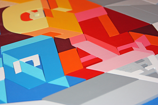
I recently featured the work of Miss Bugs on here and saw that the Miss, in MB, has a show coming up in Brighton opening on October 21st. So if you happen to be in the jolly ol' UK around then, go out of your way and swing by the show it aims to be a great body of work.
Works on Paper by Missum opens at Ink_d Gallery, Brighton on Friday 21st October – www.ink-d.co.uk


Me Alone

If I Was A Cat

In anticipation of the show, I sent Ms Missum a few questions about her work and the new direction it's taking. Enjoy.

Where did the name Missum come from?
Nickname really – I get called a lot of thing by Bugs; Miss, Missy, Missum and some I won’t repeat!

You seem to focus a lot on cats, did dogs do something to offend you?
Cats were last year, its dogs for me at the moment! I love all animals, cats and dogs. In the work I look at the emotions we give animals and what we take from them.

When a lot of other street artists are coming out from behind their curtains to work under their real names, why do you choose to stay anonymous?
It allows both of us to work on other projects under different names, or for that matter, our real names and one doesn’t then cloud the other. There is a connection between Missum and Miss Bugs and when I started this body of work we could see that certain elements were coming from the same thought process. However other work that Bugs has done under his real name comes from a very different place and as such and exists separately.

In short, I suppose staying anonymous gives us more freedom to explore different things.

Are the artists and culture icons you appropriate from in your work influences or enemies and why?
I wouldn’t say I use cultural icons in my solo Missum work… In the Miss Bugs pieces we are constantly stealing from other artists. But it’s not down to ‘influences or enemies’. The reasoning behind it is to explore ownership of ideas, working styles and the relationship and knock-on effect that artists have with one another.

You sometimes have to look harder for the artistic references in our work while others can be staring you in the face. Even then they can sometimes still go unnoticed as they are being seen out of context. We are playing with ideas of how we view art and how much of the thought process behind it we understand.

We look at links between the artists and their working methods throughout history. Artists that would not normally be considered to sit alongside each other are then remixed together, showing, for example, how the working style of Keith Haring can gel together with Picasso. And how artists from very different periods in time and culture are using very similar approaches, often where you wouldn't expect to see it.

When did you first start doing graffiti?
I wouldn’t say I was a graffiti chick, B-girl or any think like that. I didn’t take much notice of street art until I worked as part of Miss Bugs and then it felt right for the work to be part of our environment. My solo work as Missum wouldn’t ever appear on the street, it’s not really about that, it’s born out of me staying at home with my sketch book.

Have you ever been arrested doing graffiti and if so, were the cops surprised that you were a girl?
Yeah, we have been stopped pasting up in the middle of the day. I’m not sure if they were surprised that I was a girl, they seemed to be more surprised that we hadn’t get our story straight between ourselves before opening our mouths!

How long have you been working on this new body of solo work? Any good stories of challenges you overcame in its production?
I’ve been working on it on and off, in-between the Miss Bugs work, for a while now. There is no dramatic story really, etching is a very slow quiet process. Working on my own, the highlight of the day can be when Ian the sandwich guy pops in with his array of treats!

Why Ink_D gallery?
It a lovely intimate gallery, right by the sea, and perfect for this body of work.

In a past interview you said that Bugs was “the creative force behind the work”, is this solo show your way of proving you’ve come into your own and are a creative force of your own now?
Ha, did I say that? I was probably trying to get on his good side! I can get him to do anything I want with those sort of compliments … I don’t really want to be a ‘force’ with Missum, it’s more about creating an artistic space where I can play with new ideas and work with new processes.

Whose work are you loving right now?
Peter Doig

Do you want to give a shout out to an artist you think needs more respect or deserves more attention?
Bugs recently sent me a link of Matt Stuart’s photography, it’s definitely worth spending some time checking him out.

Did you send Kate and William a painting for their wedding?
No, I’m afraid not!

Works on Paper by Missum opens at Ink_d Gallery, Brighton on Friday 21st October – www.ink-d.co.uk

Saturday, August 20, 2011

Anna Garforth


The world of hobby typographers and weekend typophiles is starting to get a little overcrowded these days. That doesn't mean there's any dilution of talent out there though. Anna is an English artist and designer that takes type play to many places it's never been before. Most recently noted for her baked Edible Poster, she also works in moss, tape and trash creating type delights that cross borders.

Check it out here.

Thursday, August 11, 2011

Susan Jane Belton


Susan is a Boston area artist who focused on landscapes for most of her career, but on and off painted the coffee cups she had at the studio as an exercise. Then after 9/11 she started thinking about our United Gluttony and saw these cups as a symbol of our ability to imbibe without worry. Since then it's turned into a seriously large body of work.

Check it out here.

Tuesday, August 9, 2011

Pam et Jenny


Pam et Jenny is French for Pam and Jenny. That's all the French I know. They list themselves as designers, but one of their series caught my eye as a real work of art. Their Scam* project looks so freakin' cool. I remember playing with this technique in school, but they've taken it to a whole new level. Dragging copies over a scanner as it scans deconstructs the images and causes an RGB noise that plays really well off the grainy black and white images. Most of their source material are images from text books of old paintings, but they also toss in some 60s looking images of people dressed like Warhol and what looks like Lou Reed, though they are somewhat abstracted. The format is cool too, long and narrow so they hang to the floor and roll out into the path of the viewer.

Check them out here.

Christopher Gideon


Christopher Gideon was born in middle America and his work takes influences of his surroundings. Crosses, billboards and baseball are all themes that show up in his art. His most recent series "America's Pastime" is created entirely out of vintage baseball cards. Not the amazing ones from cigarette packs from the 30s, but mid 70s and 80s afros and burnt sienna uniforms. He butchers the cards and then pastes them back together in patterns or weaves them together to reform the original image. They are harmonious and disjointed at the same time. They actually communicate a great deal of action in many of them. If nothing else, they are a super original medium to work in and he's done a great job with them.

Check them out here.

SiT


With street style being focused so much on intense color it takes a lot for someone who uses only black to get noticed, but that's exactly what SiT has been doing this year with his series NOIR. His bold use of black and wild line style give his work an energy usually reserved for brightly colored burners.

Via SiT: Artist SIT has been part of the Amsterdam creative scene for many years. Doing action painting, graphic design, advertising and more until he got fed up. He went back to square one to find his true essence. Back to head and handcraft.


Check his work out here.

Dana Tanamachi


Dana Tanamachi is a Brooklyn designer that works in a challenging medium: chalk. Usually reserved for hopscotch courts or sidewalks, Dana has taken the craft of chalk drawing in an artful new direction. Until this, the best chalkboard type I'd seen was at the grocery store, and that was nothing to brag about. This however is something to brag about if it was done on a computer, let alone in chalk. She has been getting a lot of buzz for her Nagging Doubt wine label designs, but her work stretches far beyond that.

Check it out here.

Been a minute.


Being a new father has been nuts and cutting in on my posting time. I just noticed it's been nearly a month, sorry bout' that.

Tuesday, June 14, 2011

Aske


Russian graffiti artist Aske has been as busy inside as he has outside. He's created amazingly intricate mosaics from plywood that defy belief. They are so detailed and colorful and kind of remind me of the original Tron.

Check them out here.

Monday, May 9, 2011

Sydney Cash


I know this isn't the normal aesthetic for this blog, but I just thought the work was so cool. Sydney is a sculptor and light painter. He creates graphic images on glass and then projects light through it to create light and shadow "paintings" on the walls the glass strips occupy. There's gotta be a rad outdoor application for this.

Check it out here.

Wednesday, May 4, 2011

becca


Becca is so different from most street work out there. She's soft, even dainty and has a flair of 50s fashion to her work. Her subjects are idealized females painted in an urgent way that shows both their energy and sensuality. She also focuses on female toddlers as well with their innocence, but usually tweaks them by adding firecrackers or the such.

Check our her work here.

Ludo


It seems like this is I.I.B Parisian edition. Ludo is from Paris as well, but has a whole different style. Using only black, white and day-glo green to make his surreal images. He pirates brand images, logos and messages like Blackberry or Del Monte and mocks them with his smart takes on their markets. One of my personal faves is his Del Monte pineapple skull.

Check it out here.

C215


C215 is a stencil artist who takes details to a whole new level. He's originally from Paris but has become almost a full time traveller spreading his sickly detailed stencils over seas. His subjects are more serene than most street artists consisting of everything from cats to babies.

Check it out here.

Tuesday, May 3, 2011

Greg Papagrigoriou


Greg's a street artist from Greece (I think) and has some of the illest script styles I've seen. And he does them on walls quickly which is even more amazing.

Check it out here.

Thursday, April 28, 2011

Mr Bingo


Mr Bingo is an English illustrator with a crazy graphic eye. He's great at reducing things to their most simple and has a sick sense of humour (Eng spelling) too. He has quite a few prints for sale as well. You may recognize his work from the recent Perrier print campaign.

Check it out here.

Thomas Doyle


This is fitting for the first new post in a while. Fatherhood really is a time vampire as far as this kind of stuff goes so I'm sorry for taking so long.

Thomas Doyle is awe inspiring. Both in his craftsmanship and his patience. His terrariums must take forever to craft and he has sooo many of them. I think I just spent 40 minutes looking through his site and I didn't even finish. The work defies explanation.


Check it out here.

Wednesday, February 23, 2011

Kid Zoom


KZ is an Australian graffiti artist who has the illest can control I've ever seen. All his works are done with spray paint and uses no stencils that I could see. He's got a really amazing illustrative style while still maintaining a pretty diverse range of looks. I love his caricatures and his skulls.

Check it out here.

Tuesday, February 8, 2011

Nutmegger


Nutmegger workshop is a studio making hand painted signs inspired by vintage ones. They take the time to affect the sign in ways that the weather would. To the point that it's hard to tell which is the actual vintage sign. Their work has such great character to it, and I really want that Tea Rooms sign.

Check it out here.

Darren Booth


Darren is a painter, musician, collager, typographer. I could go on, but it's better if you see for yourself. His type collage is my favorite.

Check it out here.

Thursday, February 3, 2011

Christian Northeast


Christian is not a new talent, but I'm just learning about his magic. And his work really is magical. He's got a totally hilarious voice and an amazing, instantly recognizable style reminiscent of circus posters from the 20s and 30s. He also spans all mediums and works equally well in all. Get ready to be jealous.

Check his work out here.

Wednesday, February 2, 2011

Ben Eine

I know I know. It's been forever. It's hard to balance work, child and the endless hours I spend looking for new edgy artists. Here's a great video on one of my personal faves, Ben Eine.

Friday, January 7, 2011

Haroshi


I know it's been a while. Having a baby will do that to you. I figured I'd start it back with a bang and the work of Haroshi.
"Haroshi makes his art pieces recycling old used skateboards. His creations are born through styles such as wooden mosaic, dots, and pixels; where each element, either cut out in different shapes or kept in their original form, are connected in different styles, and shaven into the form of the final art piece. " - From Haroshi's site.

Check it out here.