Friday, October 30, 2009

Nigel Tomm


Nigel Tomm is a disrupter. He takes work made by others and disrupts it to make his own afterproduct. His photos of crumpled photos by famous photographers is a really cool series. Mostly focusing on female nudes or fashion images, he literally just crumples them to make a new, distorted image. You can read the rest of his art rantings for yourself. It's fascinating.

Check it out here.

Thursday, October 29, 2009

Kevin Cyr


One small recent regret that I have is not buying Kevin Cyr's graffiti van print from Jen Beckmen's 20X200 project. His work is so great and simple. Just great painting of everyday vehicles. Delivery trucks, panel van's, whatever. He's got such a great sign painter style to his work.

Check it out here.

Sam3


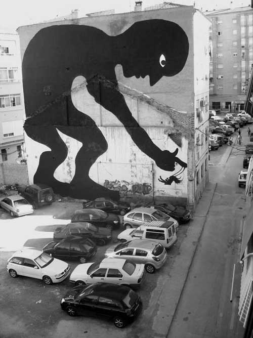
A friend reminded me today about Sam3. This Spanish artist obviously takes a que from Matisse's papercuts. He simplify figures by creating silhouettes that interact with the environment around them. He's got a great eye for finding and utilizing spaces so that his characters feel like they have just strolled in and are manipulating objects.

Check them out here.

Wednesday, October 28, 2009

Sam Schuna


Sam's work is more playful than I usually like, but his sense of humor is right on. He's also got a nice clean style (for most of his work) and doesn't really tend to overwork the ideas.

Check it out here.

GUIDO MÜNCH


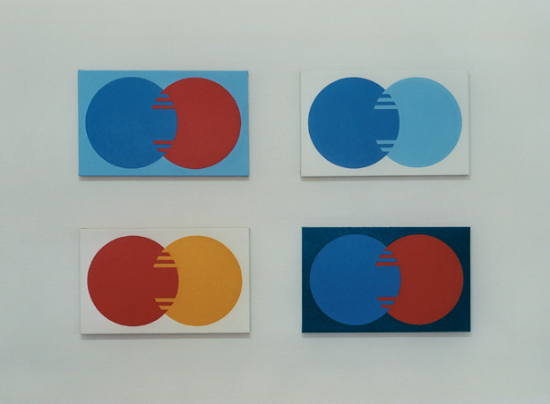
I can't tell you a whole lot about Guido, other than he's German and he seems obsessed with process and design. He takes logos that we see every day and elevates them to a simple color design by removing the names of the products. I particularly like his Krylon and Mastercard ones.

Check them out here. (Page is in all German)

Josh Keyes


Josh takes his inspiration from old science textbook illustrations. He renders, in near photorealistic detail, scenes from nature. But he pictures them as cross cuts, therefore creating a really unsettling feeling in the viewer. Similar in ways to Gregory Euclide. He loves combining subjects that would normally never be seen together. All in all, they create a feeling that he's seeing the world after the human race has vanished and when nature takes over again.

Check them out here.

Mark Jenkins


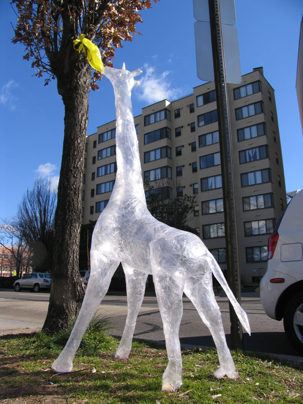
In keeping with the DC theme, Mark came on the scene some time back. His work is extremely smart as well as well crafted. Using packing tape (clear kind) he makes objects that feel at once totally foreign and at the same time familiar and places them in public situations. He also creates human forms out of discarded clothing and puts them into disrupting situations in a way of calling attention to the homeless and less privileged. They are so unsettling that many of the pictures of the installations have pedestrians stopped dead in their tracks.

Check them out here.

Diabetik


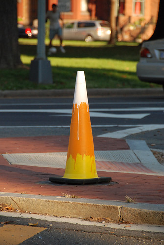
Diabetik is a graffiti artist in DC. He is clearly obsessed with sugar. Judging by his name it's either a love or a hate relationship and nothing between. He steals traffic cones and paints them to look like giant candy corns as well as making stickers of the same and stickers of those oh so popular Peeps you see around Easter.

Check it out here.

Tuesday, October 27, 2009

Word To Mother


Word to Mother's constructs combine found elements, painted fonts and scrawled faces. They represent the urban landscape and scowling public. They have a really beautiful dirty quality to them.

Check them out here.

Gregory Euclide


Gregory spends a lot of time inside staring at pictures of outside. He uses this conflict, the viewing of outside in, as a vehicle to create reliefs using pictures of nature. Instead of framing and hanging them on the wall, he crumples them and cuts them until they themselves become a landscape. He also uses objects like paint cans to create a portal through which it appears a landscape is spilling out of. Is this a comedy about man polluting nature and then trying to replicate it to make ourselves feel better? Or is it a commentary about how paint and graphic tools can fabricate an ideal of what nature is supposed to be? You decide.

Check them out here.

Erika Simmons


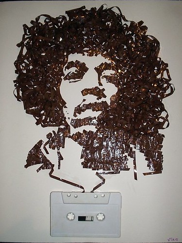
In her Ghost in the Machine series, she crafts portraits of musicians using old tape cassettes. She pulls the tape out and glues it to paper to create these simple black and white likenesses. It's impressive how much detail she can squeeze out of such a minimal medium.

Check them out here.

Monday, October 26, 2009

Jose Parla


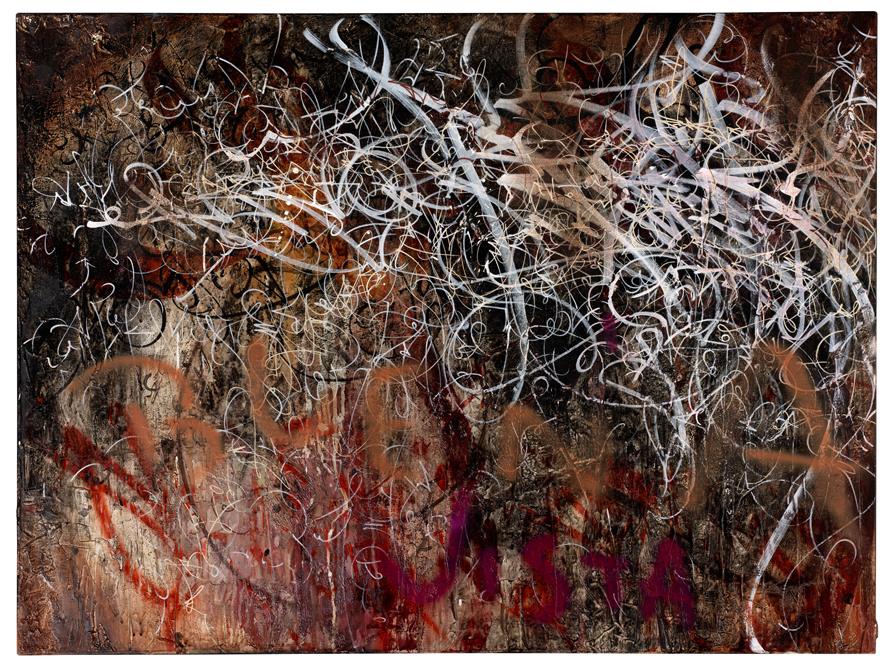
Jose is sick. He takes graffiti script and elevates it to feel like wisps of grass, or clouds billowing past in the wind. Growing up in the graffiti culture of south Florida he was surrounded by brick walls, bright colors and tropical textures. He also takes a lot of influence from Asian script fonts and calligraphy. His images make me both anxious and then, in the next second, relaxed.

Check it out here.
Sorry for the Google images link, his site is under construction.

Ryan Bubnis


Ryan has been described as a modern folk artist. However having a formal education in art should bar him from that designation. That doesn't revoke the fact that he creates really compelling images. His almost Mr Potatohead like characters have a great accessibility to them, while also being very texturally and tonally complex. I think that Paul Klee or a 5 yr old could appreciate them on the same level.

Check them out here.

Clemens Behr


Clemens Behr takes cubism to a whole new level. Using found materials like garbage bags, cardboard and tape he creates insanely confusing environments. He can take a simple room and make navigating it nearly impossible. Such a simple concept, with such simple materials.

Check them out here.

Bryan Schnelle


Bryan uses the image of a ski mask through a lot of his work. By painting it over fashion ads, it gives these normally "beautiful" people a sinister feel. As if they are secretly stealing from you, whether it be money or self-image. He also uses repetition the same way that magazines do, forcing many of what might as well be the same image down your throat. Leading you to remember them long after you've put them down.

Check them out here.

Mark Weaver


Following the collage theme, Mark is a great example of someone who does digital collage brilliantly. Anyone can cut and paste some stuff together with Photoshop, but Mark has a great gift for combining elements to make one cohesive image. To add to the greatness, he silk screens his images in 4 color process to make an actual hand rendered print.

Check it out here.

The Kube


The Kube is the artist Mark James Yamamoto. He uses vintage and current fashion images to create unsettling collages commenting about pop culture and superficiality today. He works along the same likes as Barbara Kruger, juxtaposing recognizable images with hard edged, bold text messages about the effect of mass media messaging on the self image.

Check it out here.

Ben Turnbull


A London based artist, Ben is obsessed with American culture and the way our society affects its youth. In his latest series he carves the images of guns into old school desk tops. It almost appears that the guns are growing up out of the wood, surrounded by the sophomoric graffiti that is normal on school desks. The craftsmanship is gorgeous.

Check them out here.

AJ Fosik


AJ has to be the most patient craftsman. He uses tiny pieces of wood to make his figures and masks. Each piece is hand-cut and glued together. We must be talking some kind of fume headache. His works are inspired by native masks and deities from eastern cultures. They are aggressive and delicate at the same time, and you could spend all afternoon looking at the details of just one image.

Check it out here.
Charles Krafft


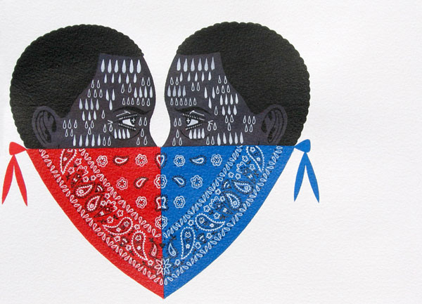
Charles has been around for quite a while, but I'm constantly inspired by his work. The contrast of technique and subject is brilliant. In his newest series, Disasterware, he uses the beautiful and intricate technique of Delft ceramic painting and contrasts it by focusing on morbid and violent subject matter. A kind of fragility of life commentary.

Check it out here.

Sunday, October 25, 2009

Monica Cook


Monica was also at Savannah the same time I was. She's an amazingly friendly person. Her painting focuses on human interaction. Often surreal in nature, she also continually explores her own sense of self through her self-portraits. She has a new show up at the Marcia Wood Gallery of her nudes.

Check them out here.


EINE is by no means new, but his work always feels fresh. He takes sign lettering and elevates each letterform to a single beautiful graphic image.

Check it out here.

Fabio Viale


Fabio is a truly unbelievable craftsman. He works exclusively in white and black marble, but chooses to focus on mundane objects like paper airplanes rather than the traditional human or religious themes. In one series, he does carve a skull form and a Madonna form, however instead of making them smooth and glossy like most marble statues, he carves the surface and details to make it look as if it's been carved from styrofoam. He also made a totally functional speedboat out of marble to cruise the canals of Venice in. He really takes craftsmanship to a new level.

Check it out here.

Friday, October 23, 2009

Eleanor Grosch


Eleanor Grosch is a graphic artist in Philadelphia. She creates mostly images of animals based on the aesthetic of Charlie Harper. She has done work for companies like Keds and Urban outfitters, but her prints remain the highlight of her work for their color and simplicity.

Check them out here.

J Penry


J is from southern Alabama. He is obsessed with art, movies and music. He uses all of the above in his work which is mostly done with pen and watercolor. He's got a sick sense of humor and spins records in his spare time.

Check his work out here.

Jonathan Casella


Jonathan Casella is a collage artist represented by the same folks as Matthew Palladino. Don't really know much about his thought behind the work, but I really its simplicity.

Check it out here.

Matthew Palladino


Matthew Palladino is a painter based in Portland. He spends the rainy days creating really visually graphic works of tigers and gangs. The gang series is at once, satirical and saddening. Showing the distinct differences as well as the disturbing similarities with some of the people involved in the violence. All in a graphic style that makes the work uniquely accessable to anyone.

Check it out here.

*Cum


This art threesome that goes by the name *Cum explores the oversexualization and undercrafting of art today. Using super minimal technique, like cut and paste and spray paint. They use images from porn and children's books as well as crudely spray painting cryptic messages or hip hop lyrics like those that appear on bathroom stalls.

Check them out here.

Bas Princen


Bas Princen's work is in the same vein as Carlos Jiménez Cahua. Exploring how man affects the landscape by building in desolate areas. All the images are absent of the builders, leaving you with the feeling that the buildings grew themselves, or that they are like an abandoned encampment, left behind when resources ran out.

Check them out here.

Carlos Jiménez Cahua


Carlos Jiménez Cahua focuses on form in his photographs. The shapes that man made structures take and how they affect the land around them. Specifically in his series Lima, he shows how the people in this area in Peru, don't sculpt the land. They simply build a structure on it and leave the surroundings alone. These images are hauntingly simple in their composition and leave you with a somewhat unsettled feeling.

Check them out here.

Jason Filipow


Jason was living in Savannah when I was there for school. He's spent some years after that exploring graphic design and screen printing techniques. His latest series of prints is striking in its use of color. From my understanding, each print of the four is four color. And each line was created by hand-cutting the shape from a colored film and then exposing the screen. Thus explaining the title: Patience & Discipline, Patience & Discipline II.

Check it out here.

Patrick Winfield


I first saw Patrick's work a while back on a site called Polanoid where artists who use Polaroid film can create profiles and share their work. He does the most arresting grid compositions. Sometimes of one scene, other times of a group of similarly colored subjects. He has an uncanny ability to form what feels like a single composition out of many elements.

Check his work out here.

Thursday, October 22, 2009

Mikey Burton


This is some really sweet letterpress work. Mike Burton lives here in Philly doing design work for advertising. He's got a great simple whimsical style that really spans the years to make it feel timeless.

Check it out here.

Robert Mars


A friend just sent me this site for the work of Robert Mars. He uses nostalgic Amerciana to remind us of what the country used to be like before it became over saturated with homogeneous architecture and strip-malls. He has a really sophisticated collage technique that makes all his found fragments flow together really smoothly.

Check it out here.

Thomas Allen


Thomas Allen came on the scene a while back with his amazing pulp cover series. He takes old dime store westerns and mystery novels and cuts up the covers to create new scenes that have a really vintage and surreal feel. He even uses multiple books and photographs them together.

Check them out here.

Erik Otto


I ran across this yesterday. Erik Otto uses found objects and reclaimed wood as well as old industrial paint to create images that are rich in color but not gaudy. Some of his forms are remeniciant of Dave Kinsey's work.

Check it out here.

A fresh new day

This blog will be dedicated to new and inspiring visual artists. In between projects, I spend hours searching blogs for a bite here or there of new visual stimulation. In all this time I've found quite a few creative people who really inspire and drive me. I hope they will do the same for you. Enjoy.